The Japan Patent Office (JPO) reversed the examiner’s rejection against IR no. 1653013 for a stylized wordmark consisting of “Cool Water” and “REBORN” arranged in two lines due to a similarity to the earlier mark “Re:born” and found both marks dissimilar.
[Appeal case no. 2025-650030, decided on February 18, 2026]
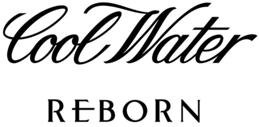
IR no. 1653013
Zino Davidoff SA, a Swiss Company, filed trademark application for a stylized word mark consisting of “Cool Water” and “REBORN” arranged in two lines (see below) for use on Perfumery products; perfumes and eaux de toilette; shower gels; skin lotions for cosmetic use; after-shave preparations; deodorants and antiperspirants for personal use in Class 3 with the JPO via the Madrid Protocol on November 13, 2023.
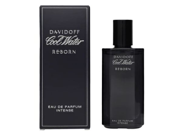
The applicant promotes Eau de Toilette bearing the mark.
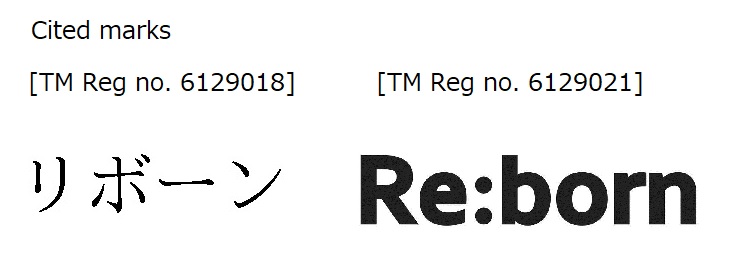
Earlier marks
On October 21, 2024, the JPO examiner decided the mark not eligible for registration under Article 4(1)(xi) of the Japan Trademark Law by citing earlier trademark registrations for the word mark “Re:born” or its transliteration written in Japanese katakana characters in Class 3.
On April 30, 2025, the applicant filed an appeal against the rejection. In the appeal, the applicant argued the dissimilarity of the marks.
JPO Appeal Board decision
The JPO Appeal Board found that the mark should be assessed in its entirety. It is not permissible to dissect the mark into individual parts and make a comparison with the cited marks by stating that:
- Despite the evident divergence in font and size, the terms “Cool Water” and “REBORN”, arranged in two lines, appear to be positioned in a close and unified manner.
- The sound “Cool water reborn” can be articulated as a single, uninterrupted phrase.
- Conceptually, there is no reason for relevant consumers to take more note of the literal element “REBORN,” since “Cool Water” also has a clear meaning.
- Therefore, the consumers are unlikely to see the term “REBORN” dominant in the mark. The Board found no evidence to support that the term plays a significant role in identifying the source of goods in question by taking into consideration actual trade practice in the relevant industry.
Based on the foregoing, the Board decided the examiner erred in finding similarity of the marks and thus erroneously applied Article 4(1)(xi).