
The Japan Patent Office (JPO) reversed the examiner’s rejection of the word mark “is me” in Classes 14, 18, and 25, by finding it dissimilar to senior TM Reg No. 5006417 for the mark “iS.ME” with an oval device.
[Appeal case no. 2025-4535, decided on December 17, 2025]
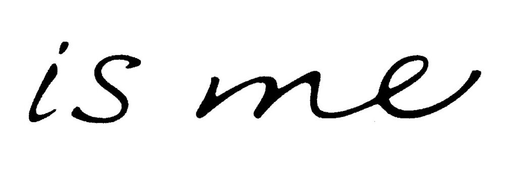
“is me”
ARIGATO CO., LTD. filed a trademark application for the stylized mark “is me” (see below) in connection with personal ornaments (Cl. 14), bags (Cl. 18), and apparel products (Cl. 25) with the JPO on February 8, 2024. [TM App no. 2024-18788]

TM Reg No. 5006417
On October 4, 2024, the JPO examiner issued a notice of ground for refusal by citing senior TM Reg No. 5006417 for the mark “IS.ME” with an oval device (see below) in Classes 12, 14, and 25.

The applicant filed a response against the refusal on November 27, 2024, to argue the dissimilarity of these marks. However, on February 4, 2025, the examiner decided to reject the entire application due to similarity to the cited mark based on Article 4(1)(xi) of the Japan Trademark Law.
On March 25, 2025, the applicant filed an appeal against the contested decision, requesting that the rejection be set aside.
JPO Appeal Board decision
The JPO Appeal Board disaffirmed the contested decision and found that the mark “is me” should not be subject to rejection under Article 4(1)(xi) by stating that:
- The mark in question consists of the letters “is me” written in a script font. Both terms, “is” and “me”, are English words generally familiar to Japanese consumers, meaning “to be” and “myself” respectively. Therefore, the mark has the sound of “iz-miː.” Meanwhile, as “is me” lacks a subjective term, it does not give rise to any specific meaning as a whole.
- The literal elements of the cited mark will not be considered inextricable from the graphical element because of a space between them, and lack of conceptual integrity as a whole. In this regard, it is reasonable to consider the literal element as dominant in the cited mark, and compare it with the mark in question to assess similarity between the marks. The literal element gives rise to various sounds, not limited to “iz-miː.”, but “ai-es-dot-emu-iː”, “iz-dot-miː.”, “ai-es-dot-miː”.
- From appearance, the cited mark features a distinctive combination of the initial letter “i” in lowercase and the subsequent three letters in uppercase, all written in bold Gothic and colored in red. This constitutes a prominent distinction from the mark in question, resulting in strong commercial impressions that are easily distinguishable.
- Aurally, even if both sounds are the same when the cited mark is pronounced as “iz-miː”, the other sounds are clearly distinguishable.
- A conceptual comparison is neutral as neither of them has any specific meaning.
- Based on the foregoing, given both marks are unlikely to cause confusion from visual and phonetic points of view, the Board has reason to believe the mark “is me” is deemed dissimilar to the cited mark as a whole.